Mercator vs. Peters: The Politics of Map Projections
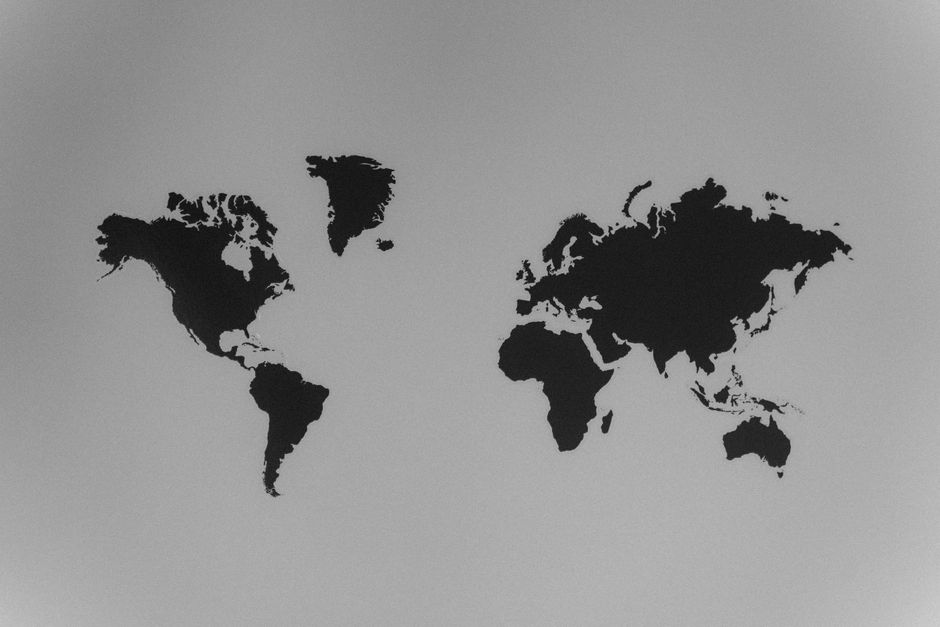
Maps are never neutral. Every world map involves a series of choices about how to represent the curved surface of the Earth on a flat plane, and those choices carry consequences for how we perceive the relative size, importance, and relationship of different regions. Two of the most widely discussed projections—the Mercator and the Peters—illustrate this point vividly. While both aim to serve particular purposes, they embody different assumptions about what a map should prioritise and, by extension, whose worldview it reinforces.
The Mercator projection, developed in the sixteenth century for navigation, and the Peters projection, introduced in the twentieth century as an equal-area alternative, have sparked debates that go beyond mathematics. They touch on issues of power, representation, and the ethics of visual communication. Understanding their histories and design logics helps illuminate how cartographic choices can shape perceptions of the world, often in subtle and long-lasting ways.
This article examines the Mercator and Peters projections in context. It considers their origins, the geometric principles behind them, and the critiques they have attracted. Rather than declaring one superior, it explores how each projection reflects specific needs and ideologies, and how map design continues to be a site of political and cultural negotiation.
Historical Context and Design Intent
The Mercator projection was created by Gerardus Mercator in 1569, a time of expanding European maritime trade and exploration. Its primary purpose was to provide a reliable tool for sailors: on a Mercator map, lines of constant bearing—known as rhumb lines—appear as straight lines, making it easier to plot a course across the oceans. This property, called conformality, preserves local angles and shapes, which is invaluable for navigation. However, it achieves this by progressively stretching the map vertically as one moves away from the equator, leading to severe distortion of area near the poles.
For centuries, the Mercator projection was used primarily for nautical charts, not for general world maps. Its adoption as a standard for wall maps and atlases in the nineteenth and twentieth centuries was driven by other factors, including the dominance of European powers and the need for a familiar framework for global display. In this context, the projection’s distortion—making Europe and North America appear larger relative to Africa and South America—coincided with and perhaps reinforced existing geopolitical hierarchies. The map’s design was not inherently ideological, but its widespread use in educational and popular settings meant that its distortions became normalized.
The Peters projection, introduced by Arno Peters in 1974, emerged from a very different context. Peters, a German historian and filmmaker, criticised the Mercator for what he saw as its Eurocentric bias and its misleading representation of the Global South. He advocated for an equal-area projection that would show all regions at their true relative sizes. The Peters projection, which is mathematically equivalent to the Gall-Peters projection (a cylindrical equal-area projection first published by James Gall in 1855), achieves this by sacrificing shape accuracy. Landmasses near the equator are stretched vertically, while those near the poles are compressed, resulting in a map where areas are correct but shapes are distorted.
Peters marketed his projection as a more socially just alternative, arguing that it gave equal visual weight to all parts of the world. While his claims were not without controversy—many cartographers pointed out that the projection was not new and that its distortions were also problematic—the debate he sparked drew attention to the politics of map design. The Peters projection was adopted by some humanitarian and educational organisations as a symbol of global equity, while others rejected it for its unfamiliar shapes and its association with Peters’s polemical style.
Geometric Principles and Their Implications
At a technical level, the Mercator and Peters projections represent opposite trade-offs. The Mercator is conformal, meaning it preserves angles and local shapes, but it distorts area increasingly toward the poles. The Peters is equal-area, meaning it preserves the relative sizes of regions, but it distorts shapes, especially at higher latitudes. Neither projection can be both conformal and equal-area; this is a fundamental limitation of representing a sphere on a plane, as proven by Carl Friedrich Gauss. The choice between them therefore depends on the purpose of the map and the values of its maker.
For navigation, the Mercator’s conformality is a decisive advantage. A straight line on a Mercator map corresponds to a constant compass bearing, which simplifies route planning. This is why it remains the standard for many marine and aeronautical charts today, even though its area distortions are well known. In these contexts, the projection’s distortions are acceptable because the map is used for a specific technical task, not for comparing the sizes of countries.
For thematic world maps that aim to show distributions of population, resources, or climate, an equal-area projection like Peters is often preferred. By preserving area, it allows viewers to make more accurate comparisons of spatial extent. However, the shape distortions can make continents look unfamiliar and can themselves introduce misinterpretations—for example, Africa appears elongated and South America looks stretched. These visual oddities can distract from the data being presented and may even create new biases.
Both projections, therefore, involve compromises. The Mercator’s distortion of area can lead to a psychological overemphasis on high-latitude regions, which historically have been predominantly white and economically powerful. The Peters projection’s distortion of shape can make it harder to recognise countries and may inadvertently reinforce stereotypes about the ‘otherness’ of certain regions. Understanding these effects requires looking beyond the mathematics to the social and political contexts in which maps are used.
The Politics of Representation
The debate between Mercator and Peters is often framed as a clash between a colonialist legacy and a postcolonial corrective. Critics of the Mercator argue that its Eurocentric distortion naturalises a worldview in which Europe and North America are central and dominant. By making Africa and South America appear smaller than they are, the map may subtly undermine the perceived importance of those regions. This critique gained traction in the late twentieth century, as scholars and activists began to scrutinise the ways in which cartography can serve power.
Supporters of the Peters projection present it as a more equitable alternative, one that gives all countries their true size and thus challenges ingrained hierarchies. They argue that by showing Africa and South America at their full extent, the map can help correct misconceptions and promote a fairer global perspective. For these advocates, the choice of projection is not merely technical but ethical, a statement about whose world matters.
However, the politics of the Peters projection are not straightforward. Some cartographers have criticised Peters for overstating the novelty of his projection and for using aggressive marketing that polarised the cartographic community. Others have noted that the projection’s shape distortions can create new problems, such as making it difficult to recognise coastlines or to compare shapes of countries. Moreover, the projection itself does not automatically produce a progressive worldview; it can be used in ways that reinforce or challenge stereotypes depending on the context.
In practice, many modern cartographers avoid both extremes, opting for compromise projections such as the Robinson or Winkel Tripel, which balance area and shape distortions. These projections are often used by organisations like National Geographic and the United Nations, reflecting a desire for a more neutral representation that avoids the most glaring biases of either Mercator or Peters. The choice of projection, however, remains a political act, because it involves deciding which distortions are acceptable and which values to prioritise.
Contemporary Perspectives and Practical Applications
Today, the Mercator and Peters projections continue to be used in different domains, often without much public awareness of their histories. The Mercator remains prevalent in web mapping platforms, such as OpenStreetMap and many online map services, because its conformality simplifies the rendering of tiles and supports smooth zooming. This has led to a new wave of criticism, as the Mercator’s area distortions become embedded in everyday digital experiences, from weather apps to real estate listings.
The Peters projection, while less common in mainstream cartography, retains a presence in educational settings and in advocacy materials. Some non-governmental organisations and social justice groups use it to highlight global inequality and to emphasise the importance of the Global South. In these contexts, the projection serves as a rhetorical tool, its equal-area property aligning with messages of equity and inclusion.
For businesses and organisations that create maps, the choice of projection is a strategic decision. A company like Cartographica, which produces custom cartographic solutions, might consider the purpose of each map, the audience, and the potential interpretations. A map designed for navigation would logically use a conformal projection, while a map for displaying demographic data might use an equal-area one. The key is to make the choice transparent and to educate users about the distortions inherent in any projection.
Ultimately, the Mercator vs. Peters debate highlights that there is no perfect map. Every projection distorts reality in some way, and the best we can do is to choose consciously and to remain aware of the implications. As geographic information systems and digital mapping become more pervasive, the need for critical map literacy grows. Users should ask not only what a map shows but also what it hides, and how its design might shape their understanding of the world.
Conclusion: Navigating the Politics of Projection
The Mercator and Peters projections are more than technical tools; they are artefacts of their times, reflecting the priorities and prejudices of the societies that produced them. The Mercator emerged from an age of exploration and trade, its conformality serving the practical needs of sailors. Its later adoption as a standard world map inadvertently promoted a distorted view that favoured certain regions. The Peters projection arose as a critique of that legacy, aiming to restore area accuracy and to challenge Eurocentrism, but it too brought its own distortions and controversies.
For anyone who uses or encounters maps, understanding this history is essential. It encourages a more nuanced view of cartographic representation, one that acknowledges the inevitability of distortion and the importance of context. Whether in navigation, education, or advocacy, the choice of projection should be made with an awareness of its political and perceptual consequences. By engaging with these issues, we can become more informed map readers and more responsible map makers.